Rate your website in seconds – get instant feedback.
I will rate your website's design and give recommendations to enhance its visual appeal and user experience. See how your site ranks on the leaderboard!

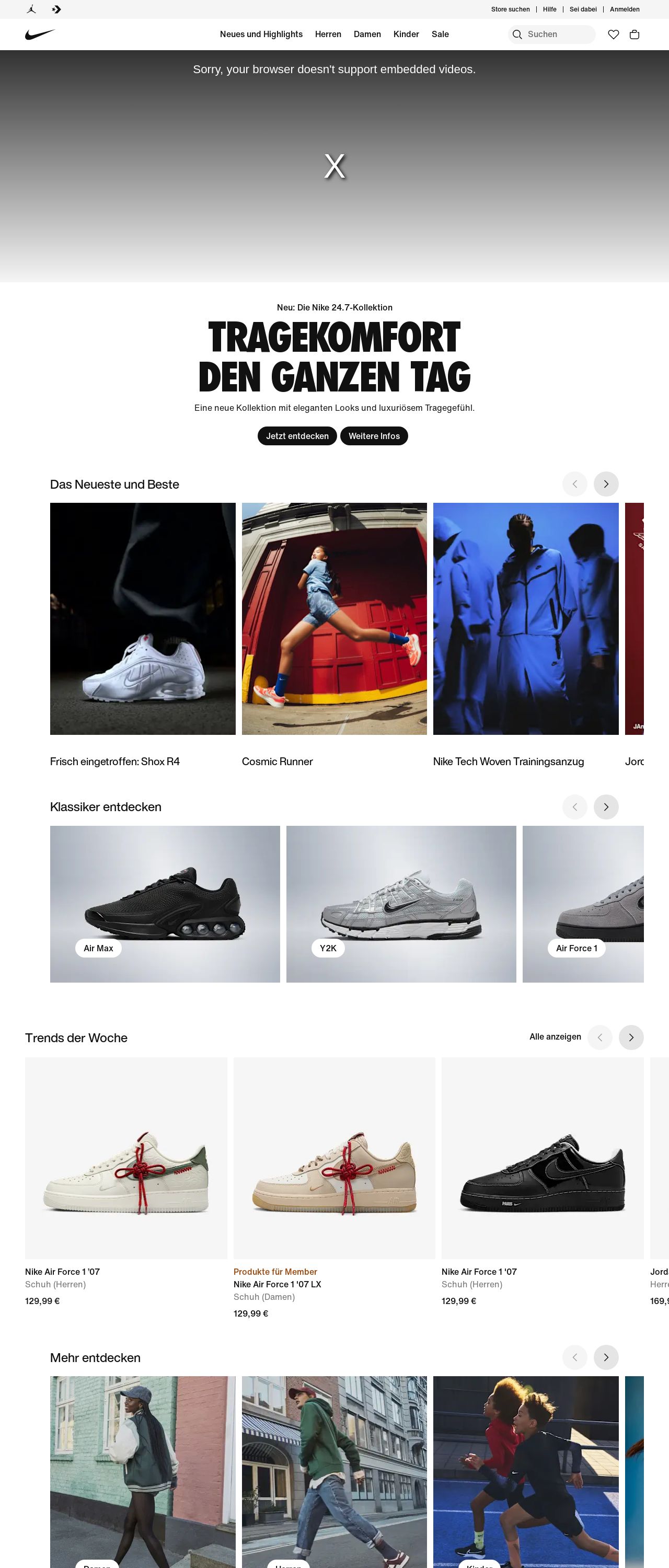
Nike. Just Do It. Nike DE
Analyzed by AI for fun and insights - not to be taken too seriously!
Visual Design
The visual design of the Nike website is modern and sleek, with a focus on showcasing the brand's iconic products. The use of bold colors, clean typography, and high-quality images creates a visually appealing and engaging experience for users. The website's layout is well-organized, making it easy to navigate and find specific products or sections. The use of white space effectively balances the amount of content on the page, creating a clean and uncluttered design. Additionally, the incorporation of Nike's signature red and black colors adds a touch of personality and brand recognition. Overall, the visual design effectively communicates the brand's values and style while providing a user-friendly experience.
Recommendation:
Consider adding more interactive elements, such as videos or animations, to enhance the user experience and make the website more engaging.
Layout and Clarity
The layout of the Nike website is well-structured and easy to follow, making it simple for users to find what they're looking for. The use of clear headings, concise summaries, and prominent calls-to-action helps guide the user through the website and encourages them to take action. The website's navigation menu is easily accessible and allows users to quickly move between different sections. The use of white space effectively separates different sections of the website, creating a clear visual hierarchy and making it easy to scan and read content. Overall, the layout is well-designed, making it easy for users to find information and complete tasks.
Recommendation:
Consider adding more visual cues, such as icons or graphics, to help users quickly identify different sections of the website and understand the content.
Content
The content on the Nike website is well-organized and easy to read, with clear headings, concise summaries, and prominent calls-to-action. The use of high-quality images and videos effectively showcases the brand's products and styles, while the product descriptions provide detailed information about each item. The website's blog section is well-maintained and regularly updated, providing users with fresh and relevant content. Overall, the content is engaging, informative, and effective in communicating the brand's values and style.
Recommendation:
Consider adding more user-generated content, such as customer reviews or testimonials, to enhance the website's social proof and credibility.
This website was last rated on Jan. 27, 2025, 2:03 p.m.
Disclaimer: ratemysite.app is not affiliated with the website you are viewing, and does not endorse it in any way.
Ratings are subjective and based on AI's analysis. We filter out explicit or dangerous content, but cannot guarantee that all sites are safe.

All rights reserved. © ratemysite.app 2024. Contact: hello @ domain.