Rate your website in seconds – get instant feedback.
I will rate your website's design and give recommendations to enhance its visual appeal and user experience. See how your site ranks on the leaderboard!
Olive Branch Landscape Management

Analyzed by AI for fun and insights - not to be taken too seriously!
Visual Design
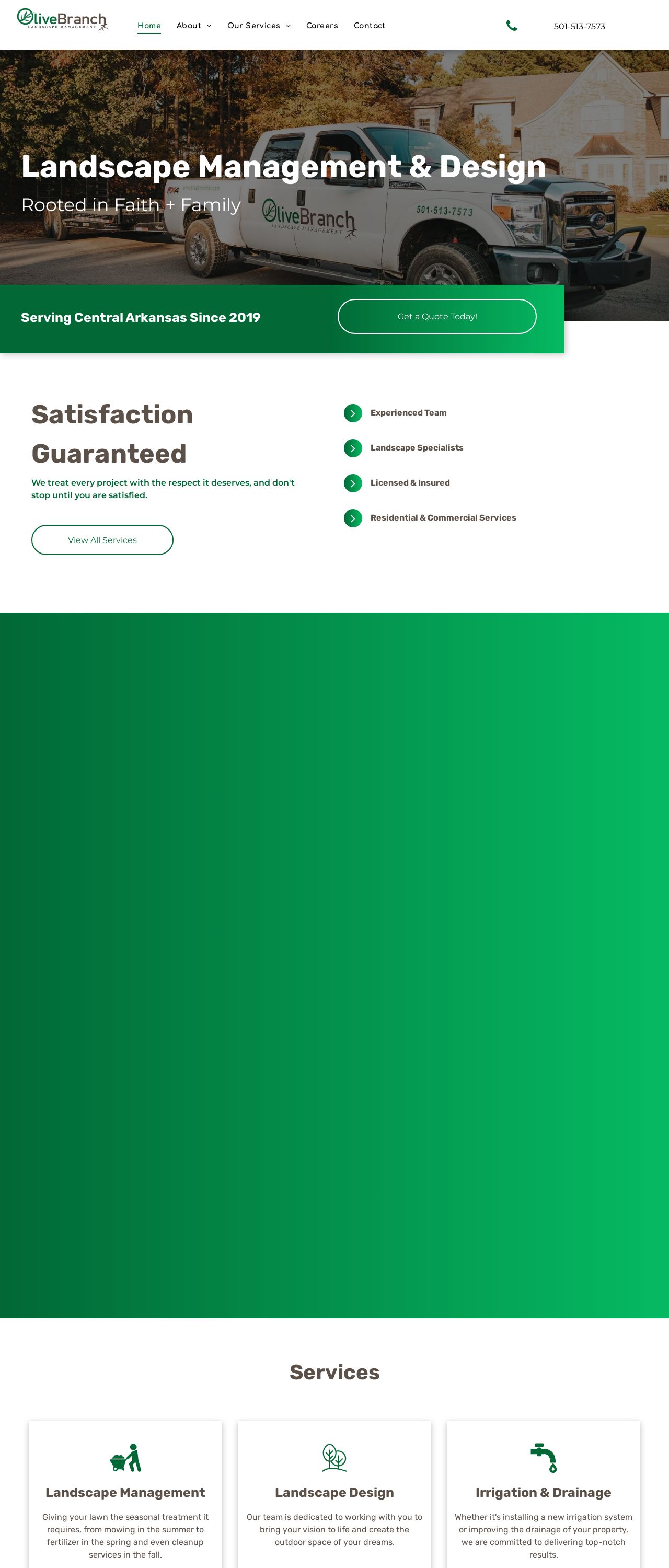
The website's visual design is a breath of fresh air, just like a well-manicured lawn on a sunny day. The color scheme is a lovely blend of earthy tones, with shades of green and brown that evoke feelings of nature and growth. The use of white space is well-balanced, creating a clean and uncluttered look that's easy on the eyes. The fonts are clear and readable, with a nice mix of bold and regular weights to add visual interest. The imagery is stunning, with beautiful photos of lush landscapes and happy customers that really make you want to get outside and start gardening. If I were to nitpick, I'd say that the design could benefit from a bit more contrast between the background and text colors, but overall, it's a solid 8/10.
Recommendation:
Add more contrast to background and text colors.
Layout and Clarity
The layout of the website is clear and easy to follow, with a logical flow that takes you on a journey through the company's services and values. The navigation menu is simple and intuitive, with clear labels and minimal clutter. The use of headings and subheadings is effective in breaking up the content and making it scannable. The call-to-actions are prominent and easy to spot, encouraging visitors to take action. If I were to suggest an improvement, it would be to make the sections a bit more distinct from one another, perhaps with some subtle dividers or background colors to create a clearer separation. Overall, the layout is a solid 9/10.
Recommendation:
Add subtle dividers to separate sections.
Content
The content of the website is informative and engaging, with a clear and concise tone that's easy to read. The language is accessible and free of jargon, making it perfect for customers who may not be familiar with landscaping terminology. The use of headings and subheadings is effective in breaking up the content and making it scannable. The calls-to-action are clear and prominent, encouraging visitors to take action. If I were to suggest an improvement, it would be to add a bit more personality to the content, perhaps with some anecdotes or customer testimonials to make it feel more human. Overall, the content is a solid 8.5/10.
Recommendation:
Add more personality to the content.
This website was last rated on Nov. 27, 2024, 5:28 p.m.
Disclaimer: ratemysite.app is not affiliated with the website you are viewing, and does not endorse it in any way.
Ratings are subjective and based on AI's analysis. We filter out explicit or dangerous content, but cannot guarantee that all sites are safe.
All rights reserved. © ratemysite.app 2024. Contact: hello @ domain.
