Rate your website in seconds – get instant feedback.
I will rate your website's design and give recommendations to enhance its visual appeal and user experience. See how your site ranks on the leaderboard!
Pimp my Jpg

Analyzed by AI for fun and insights - not to be taken too seriously!
Visual Design
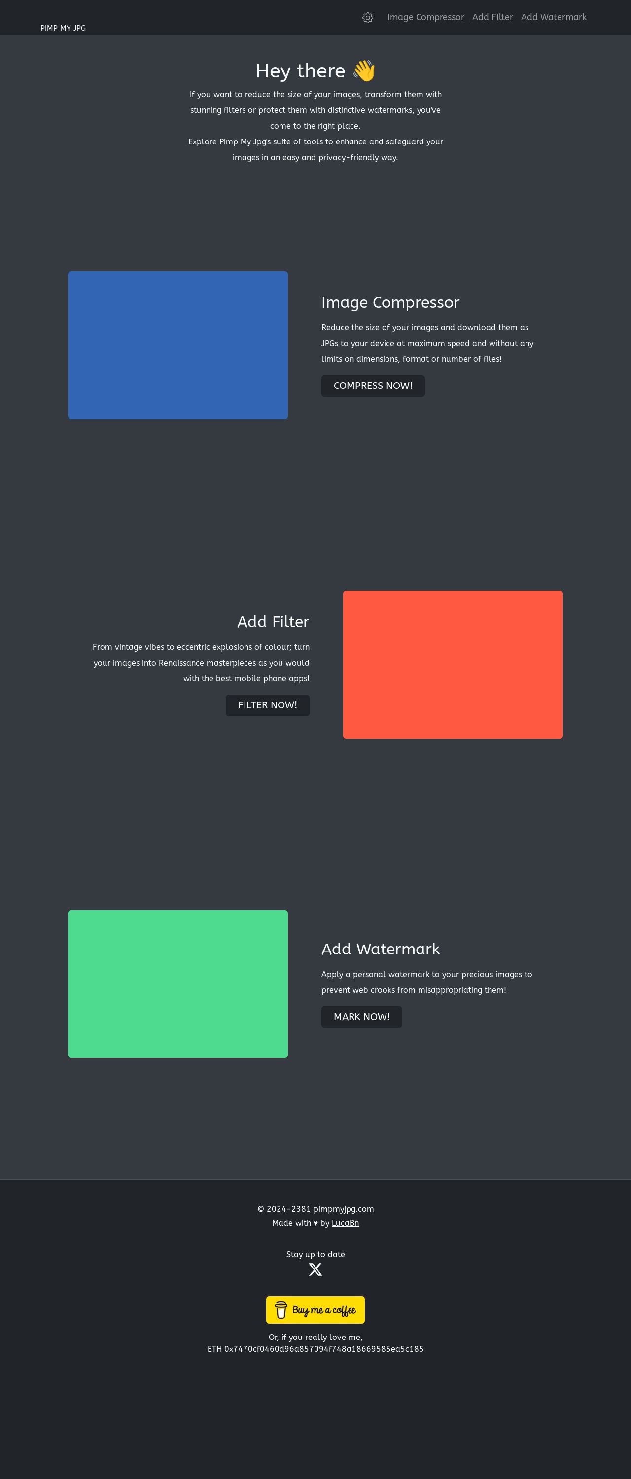
The visual design of Pimp my Jpg is a breath of fresh air, with a clean and modern aesthetic that's sure to grab the user's attention. The use of bright colors such as blue, red, and green creates a fun and playful vibe, while the simple and minimalistic layout makes it easy to navigate. The font is clear and easy to read, and the use of icons and graphics adds a touch of personality to the site. The overall design is well-balanced and visually appealing, making it a pleasure to explore. However, the background could be a bit more exciting, and the use of images could be more consistent. Additionally, the site could benefit from a bit more contrast between the background and text to make it easier to read. Overall, the visual design is a strong point of the site, but there's room for improvement.
Recommendation:
Add more contrast and images.
Layout and Clarity
The layout of Pimp my Jpg is simple and easy to follow, with a clear and concise structure that makes it easy to find what you're looking for. The use of headings and subheadings helps to break up the content and create a clear hierarchy, and the white space is used effectively to create a clean and uncluttered design. The site is also well-organized, with each section clearly labeled and easy to navigate. However, the site could benefit from a bit more visual interest, and the use of images could be more consistent. Additionally, the site could benefit from a bit more interactivity, such as hover effects or animations, to make it more engaging. Overall, the layout is well-designed and easy to use, but there's room for improvement.
Recommendation:
Add more visual interest and interactivity.
Content
The content of Pimp my Jpg is clear and concise, with a focus on the site's main features and benefits. The language is simple and easy to understand, and the use of headings and subheadings helps to break up the content and create a clear hierarchy. The site also does a good job of explaining...the benefits of using the site, such as reducing image size and adding filters. However, the content could be more engaging and persuasive, and the site could benefit from more social proof, such as customer testimonials or reviews. Additionally, the site could benefit from more calls-to-action, encouraging users to try out the site's features and services. Overall, the content is clear and concise, but could be more engaging and persuasive.
Recommendation:
Make content more engaging and persuasive.
This website was last rated on Nov. 19, 2024, 2:22 p.m.
Disclaimer: ratemysite.app is not affiliated with the website you are viewing, and does not endorse it in any way.
Ratings are subjective and based on AI's analysis. We filter out explicit or dangerous content, but cannot guarantee that all sites are safe.
All rights reserved. © ratemysite.app 2024. Contact: hello @ domain.
