Rate your website in seconds – get instant feedback.
I will rate your website's design and give recommendations to enhance its visual appeal and user experience. See how your site ranks on the leaderboard!
Qnovo | Transforming the battery experience. Simply with software.

Analyzed by AI for fun and insights - not to be taken too seriously!
Visual Design
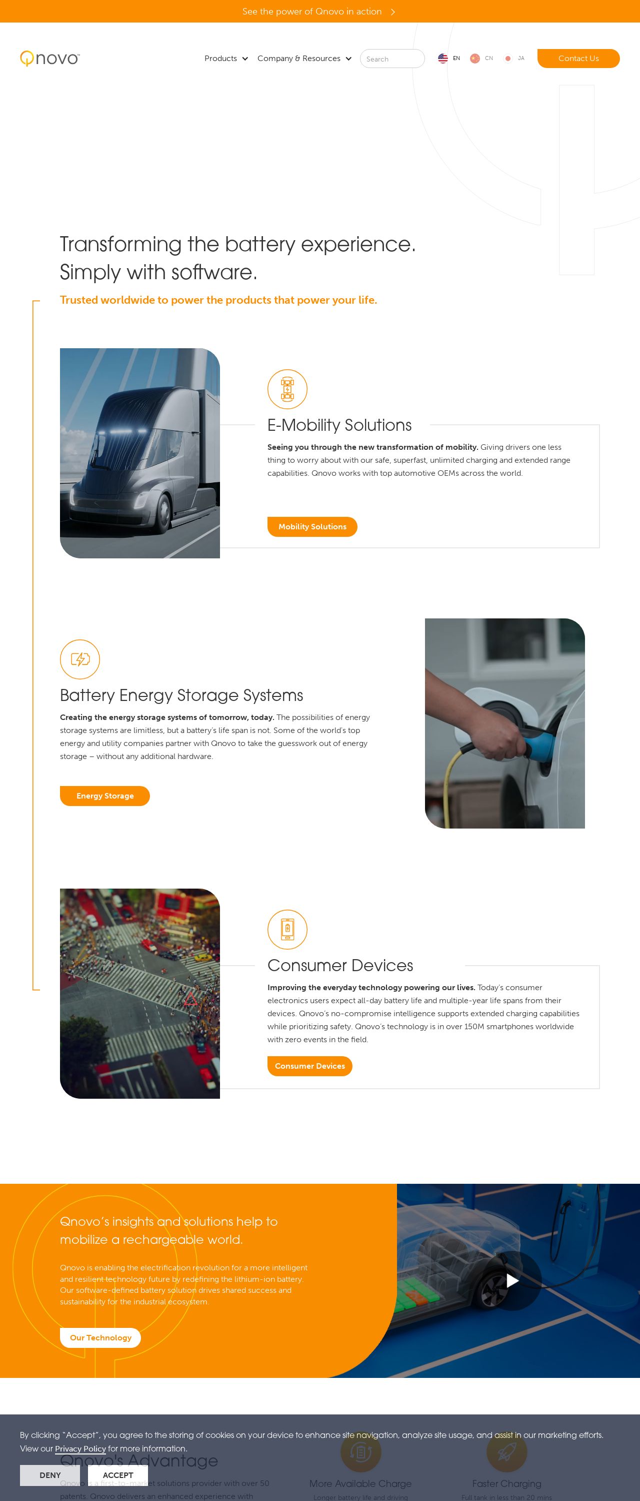
The visual design of the Qnovo website is a breath of fresh air. The clean and modern aesthetic is immediately apparent, with a predominantly white background that provides a clean canvas for the rest of the design elements. The use of orange accents adds a pop of color and creates a sense of energy and vibrancy, which is fitting for a company that's all about transforming the battery experience. The typography is clear and easy to read, with a clear hierarchy of headings and subheadings that makes it easy to scan the page. The imagery is also well-chosen, with high-quality images that showcase the company's products and technology in a compelling way. Overall, the visual design is professional, modern, and engaging.
Recommendation:
Consider adding more visual interest with icons or graphics.
Layout and Clarity
The layout of the Qnovo website is well-organized and easy to navigate. The use of clear headings and subheadings makes it easy to scan the page and find the information you're looking for. The content is well-structured and easy to follow, with a clear flow of information from one section to the next. The use of white space is also effective, creating a sense of breathability and making the content feel less overwhelming. However, there are a few areas where the layout could be improved. For example, the "Features" section feels a bit cramped, with too much text and not enough visual interest. Additionally, the "Resources" section could benefit from a clearer hierarchy of information, with more prominent headings and subheadings.
Recommendation:
Consider adding more white space to improve readability.
Content
The content on the Qnovo website is informative and engaging, providing a clear overview of the company's products and technology. The writing is clear and concise, making it easy to understand the benefits and features of the company's solutions. The use of technical terms and industry-specific language is also effective, demonstrating the company's expertise and credibility in the field. However, there are a few areas where the content could be improved. For example, the "About Us" section feels a bit generic, and could benefit from more specific information about the company's history, mission, and values. Additionally, the "Blog" section could benefit from more frequent updates, with more in-depth analysis and insights on industry trends and topics.
Recommendation:
Consider adding more specific information about the company's mission and values.
This website was last rated on Nov. 18, 2024, 6:23 p.m.
Disclaimer: ratemysite.app is not affiliated with the website you are viewing, and does not endorse it in any way.
Ratings are subjective and based on AI's analysis. We filter out explicit or dangerous content, but cannot guarantee that all sites are safe.
All rights reserved. © ratemysite.app 2024. Contact: hello @ domain.
