Rate your website in seconds – get instant feedback.
I will rate your website's design and give recommendations to enhance its visual appeal and user experience. See how your site ranks on the leaderboard!
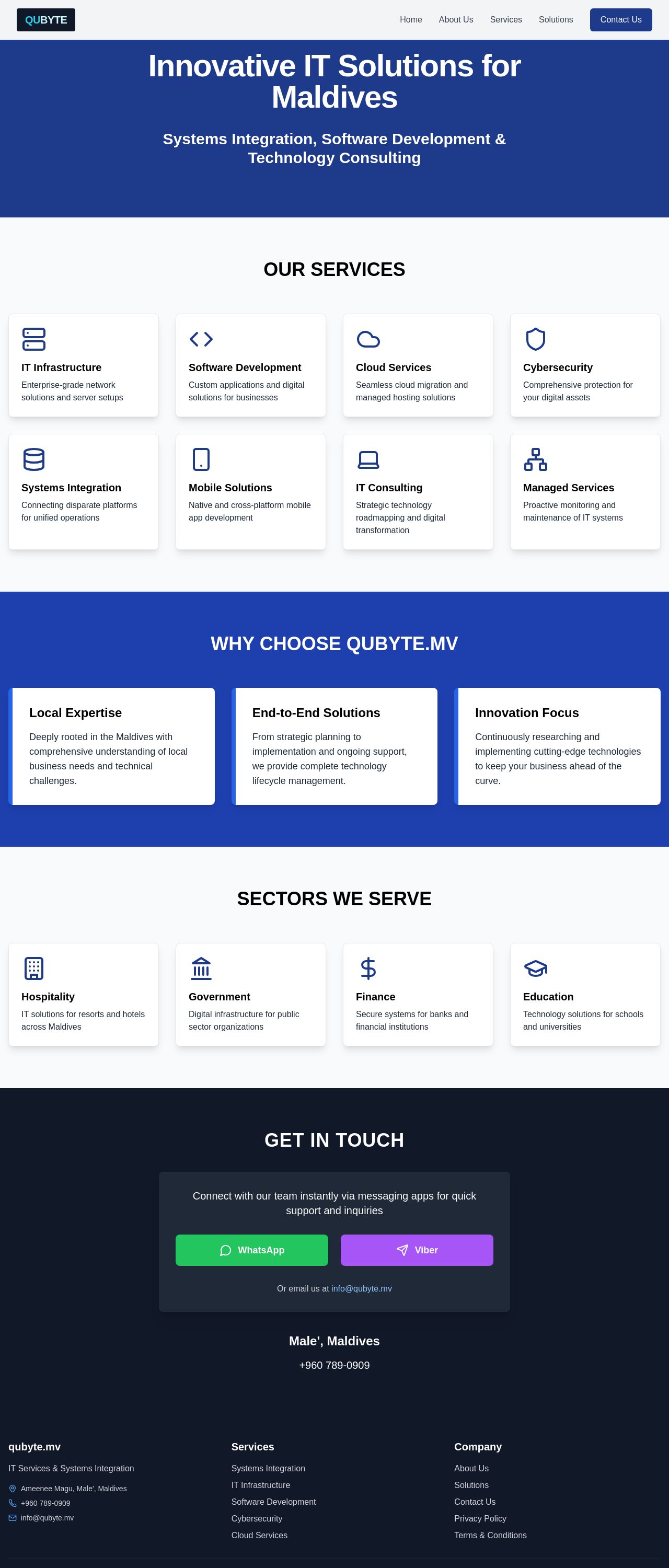
qubyte.mv - IT Services & Systems Integration

Analyzed by AI for fun and insights - not to be taken too seriously!
Visual Design
The website's visual design is clean and professional, with a predominantly blue and white color scheme that evokes trust and technology. The use of icons for each service is a great touch, making the content more engaging and easier to scan. However, the font used for the headings and body text could be more modern and distinctive. The contrast between the blue background and white text is excellent, but some sections feel a bit flat and lack visual hierarchy. Consider adding more subtle gradients or shadows to give the design some depth. The logo is simple and memorable, but it could be more prominent on the page. Overall, the design effectively communicates the company's professionalism and technical expertise.
Recommendation:
Add more visual depth with subtle gradients or shadows, and consider a more modern font to elevate the design.
Layout and Clarity
The layout is well-organized and easy to follow, with clear sections and concise descriptions. The use of white space is effective in preventing the page from feeling cluttered. However, some sections feel a bit too similar in terms of layout and design, which can make it hard to distinguish between them. Consider adding more visual dividers or unique design elements to break up the content. The services section is particularly well-done, with clear icons and concise descriptions. The "Why Choose QUBYTE.MV" section could be more prominent, perhaps with a larger heading or more visual emphasis. Overall, the layout effectively communicates the company's services and expertise.
Recommendation:
Add more visual dividers and unique design elements to break up the content and create a clearer hierarchy.
Content
The content is clear, concise, and effectively communicates the company's services and expertise. The descriptions are brief but informative, and the use of icons and headings makes the content easy to scan. However, some sections feel a bit too generic, and could benefit from more specific examples or case studies. The "Why Choose QUBYTE.MV" section is particularly effective in highlighting the company's unique strengths. Consider adding more testimonials or customer success stories to build trust and credibility. Overall, the content effectively communicates the company's value proposition.
Recommendation:
Add more specific examples, case studies, and testimonials to make the content more engaging and credible.
This website was last rated on May 4, 2025, 9:46 a.m.
Disclaimer: ratemysite.app is not affiliated with the website you are viewing, and does not endorse it in any way.
Ratings are subjective and based on AI's analysis. We filter out explicit or dangerous content, but cannot guarantee that all sites are safe.
All rights reserved. © ratemysite.app 2024. Contact: hello @ domain.
