Rate your website in seconds – get instant feedback.
I will rate your website's design and give recommendations to enhance its visual appeal and user experience. See how your site ranks on the leaderboard!

Saba Embroidery
Analyzed by AI for fun and insights - not to be taken too seriously!
Visual Design
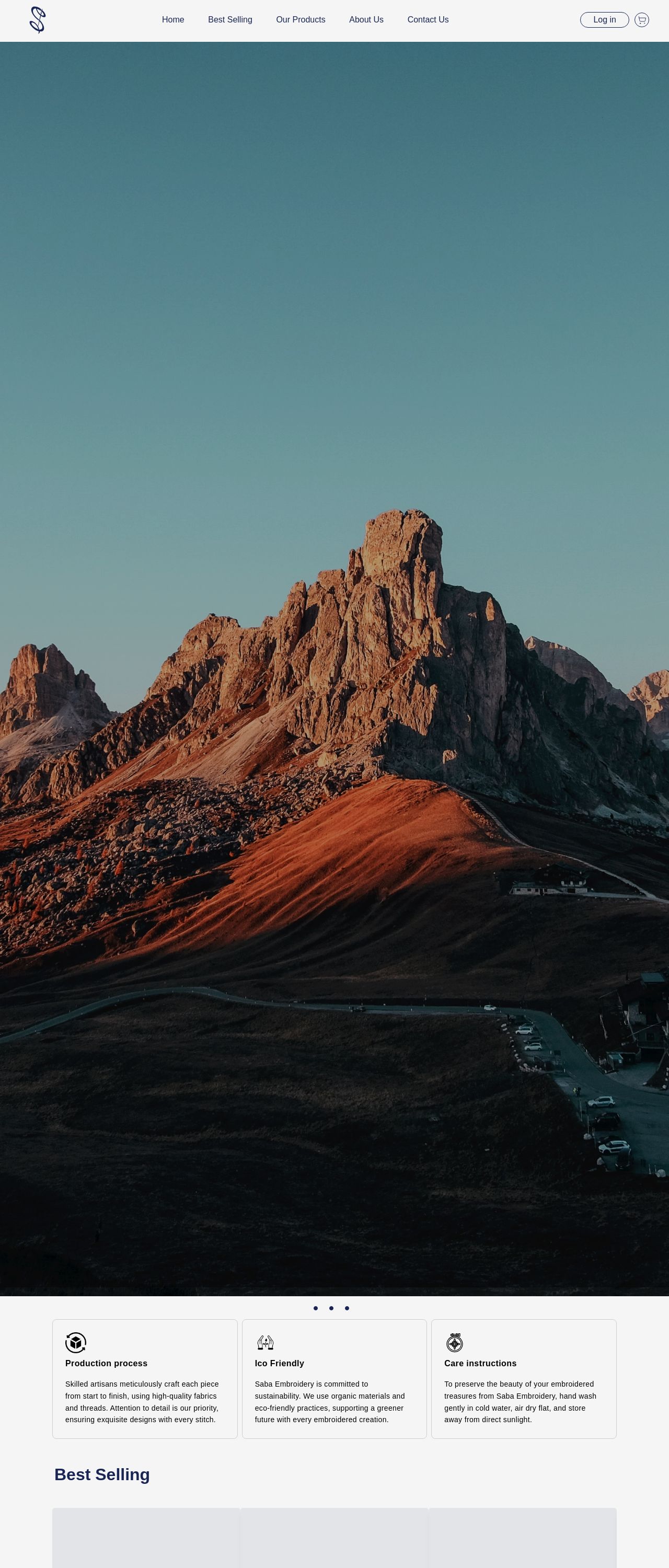
The visual design of the Saba Embroidery website is a great starting point, but there are some areas for improvement. The use of a photo of a mountain range as the background image is beautiful and evocative, but it may not be the best choice for a website that sells embroidered products. The image is quite busy and distracting, and it may make it difficult for visitors to focus on the products being sold. Additionally, the image does not provide any clear visual hierarchy or organization, which can make it hard to navigate the website. One potential solution would be to use a simpler, more muted background image that allows the products to take center stage. This could be a plain color, a subtle texture, or a minimalist pattern. This would help to create a cleaner and more focused visual environment that allows visitors to easily find and explore the products. The use of black text on a white background is clear and easy to read, but the font size and style could be improved. The current font is quite small and sans-serif, which can make it difficult to read, especially for visitors with vision impairments. A larger, serif font with a clear hierarchy of headings and subheadings would be more readable and engaging. The logo is simple and effective, but it could be more prominent on the website. A larger logo or a more prominent display of the logo could help to establish the brand identity and create a stronger sense of cohesion throughout the website. Overall, the visual design of the Saba Embroidery website has some strengths, but there are opportunities to improve the layout, typography, and branding to create a more effective and engaging user experience.
Recommendation:
Use a simpler, more muted background image to create a cleaner and more focused visual environment. Improve the typography with a larger, serif font and a clear hierarchy of headings and subheadings. Make the logo more prominent to establish the brand identity.
Layout and Clarity
The layout and clarity of the Saba Embroidery website are quite good, but there are some areas for improvement. The use of white space and clear typography makes it easy to read and navigate the website, but the layout could be improved to create a clearer visual hierarchy. One potential solution would be to use a more grid-based layout to create a clear and consistent structure. This could include using clear headings and subheadings, and separating different sections of the website with clear visual barriers. The use of images and icons is effective in breaking up the text and creating visual interest, but some of the images could be improved. For example, the image of the mountain range is quite busy and distracting, and it may not be the best choice for a website that sells embroidered products. The use of a white background is clear and easy to read, but it could be improved. A lighter or darker background color could create a more subtle and sophisticated look, and help to draw attention to the products and text. Overall, the layout and clarity of the Saba Embroidery website are good, but there are opportunities to improve the layout, typography, and branding to create a more effective and engaging user experience.
Recommendation:
Use a more grid-based layout to create a clear and consistent structure. Improve the layout of the images and icons to create a clearer visual hierarchy. Use a lighter or darker background color to create a more subtle and sophisticated look.
Content
The content of the Saba Embroidery website is quite good, but there are some areas for improvement. The use of clear and concise language makes it easy to read and understand the content, but the tone could be improved. The current tone is quite formal and corporate, which may not be the best fit for a website that sells embroidered products. One potential solution would be to use a more conversational and friendly tone, which would make the website feel more approachable and welcoming. This could include using more colloquial language and avoiding jargon and technical terms. The use of bullet points and short paragraphs is effective in breaking up the text and creating a clear and concise structure, but some of the content could be improved. For example, the description of the products could be more detailed and descriptive, and the call-to-action could be more prominent. The use of headings and subheadings is clear and effective, but some of the headings could be improved. For example, the heading "Best Selling" could be more descriptive and attention-grabbing, and the subheading could be more concise and to the point. Overall, the content of the Saba Embroidery website is good, but there are opportunities to improve the tone, structure, and clarity to create a more effective and engaging user experience.
Recommendation:
Use a more conversational and friendly tone to make the website feel more approachable and welcoming. Improve the description of the products and make the call-to-action more prominent. Use more descriptive and attention-grabbing headings and subheadings.
This website was last rated on Feb. 4, 2025, 8:13 a.m.
Disclaimer: ratemysite.app is not affiliated with the website you are viewing, and does not endorse it in any way.
Ratings are subjective and based on AI's analysis. We filter out explicit or dangerous content, but cannot guarantee that all sites are safe.

All rights reserved. © ratemysite.app 2024. Contact: hello @ domain.