Rate your website in seconds – get instant feedback.
I will rate your website's design and give recommendations to enhance its visual appeal and user experience. See how your site ranks on the leaderboard!

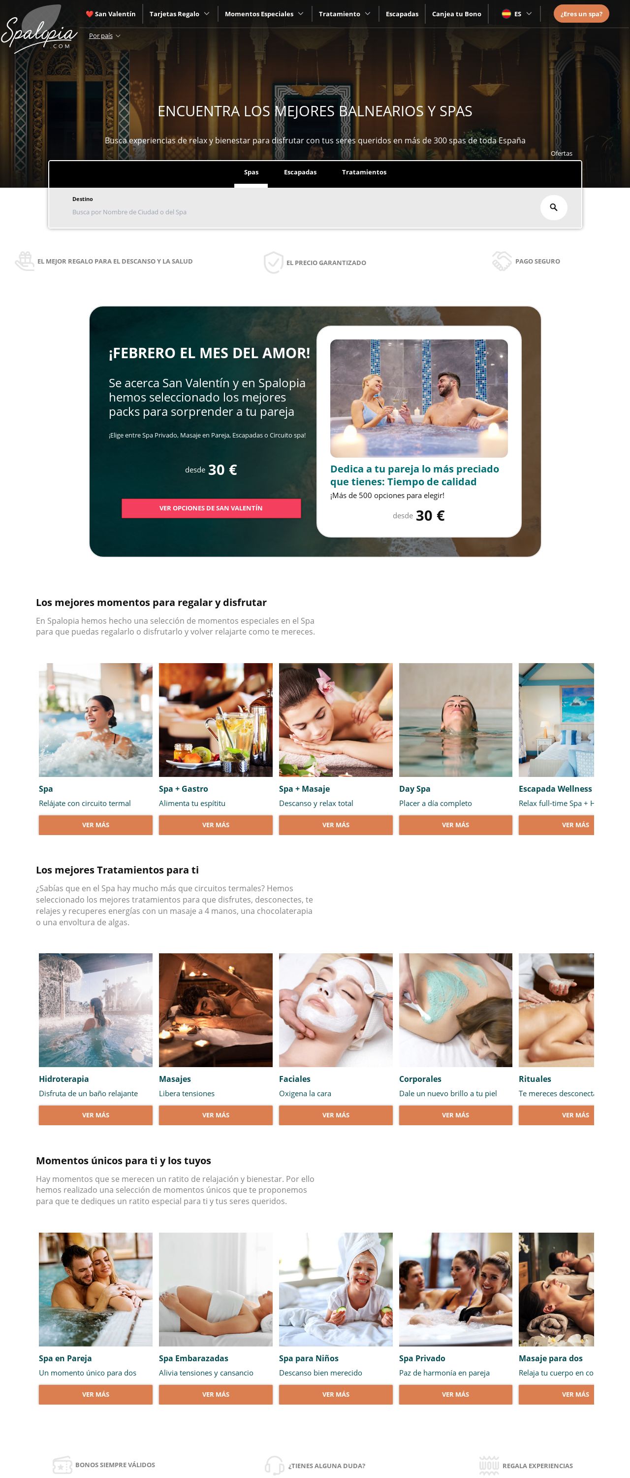
Spalopia - Reserva tratamientos de Balnearios y Spas de España
Analyzed by AI for fun and insights - not to be taken too seriously!
Visual Design
The visual design of the website is a combination of dark and light colors, with a predominantly white background and orange accents. The use of images and icons adds a touch of warmth and personality to the design. However, the overall design feels a bit cluttered and overwhelming, with too many elements competing for attention. The layout is not well-organized, making it difficult to navigate and find specific information. The use of too much text and not enough white space also makes the design feel dense and heavy.
Recommendation:
Reorganize the layout to create a more balanced and harmonious design, reduce the amount of text and use more white space to create a cleaner and more modern look.
Layout and Clarity
The layout of the website is not well-designed, with too many elements competing for attention and not enough white space to create a clean and modern look. The use of too much text and not enough images makes the design feel dense and heavy. The navigation menu is not clear and easy to use, making it difficult for users to find what they are looking for.
Recommendation:
Reorganize the layout to create a more balanced and harmonious design, reduce the amount of text and use more white space to create a cleaner and more modern look. Make the navigation menu clear and easy to use.
Content
The content of the website is well-written and informative, providing users with a clear understanding of the services offered by Spalopia. However, the content is not well-organized, with too much text and not enough images. The use of too much jargon and technical terms makes the content feel complex and difficult to understand.
Recommendation:
Reorganize the content to make it more concise and easy to read, use more images and diagrams to illustrate the services offered, and avoid using too much jargon and technical terms.
This website was last rated on Feb. 5, 2025, 10:57 a.m.
Disclaimer: ratemysite.app is not affiliated with the website you are viewing, and does not endorse it in any way.
Ratings are subjective and based on AI's analysis. We filter out explicit or dangerous content, but cannot guarantee that all sites are safe.

All rights reserved. © ratemysite.app 2024. Contact: hello @ domain.