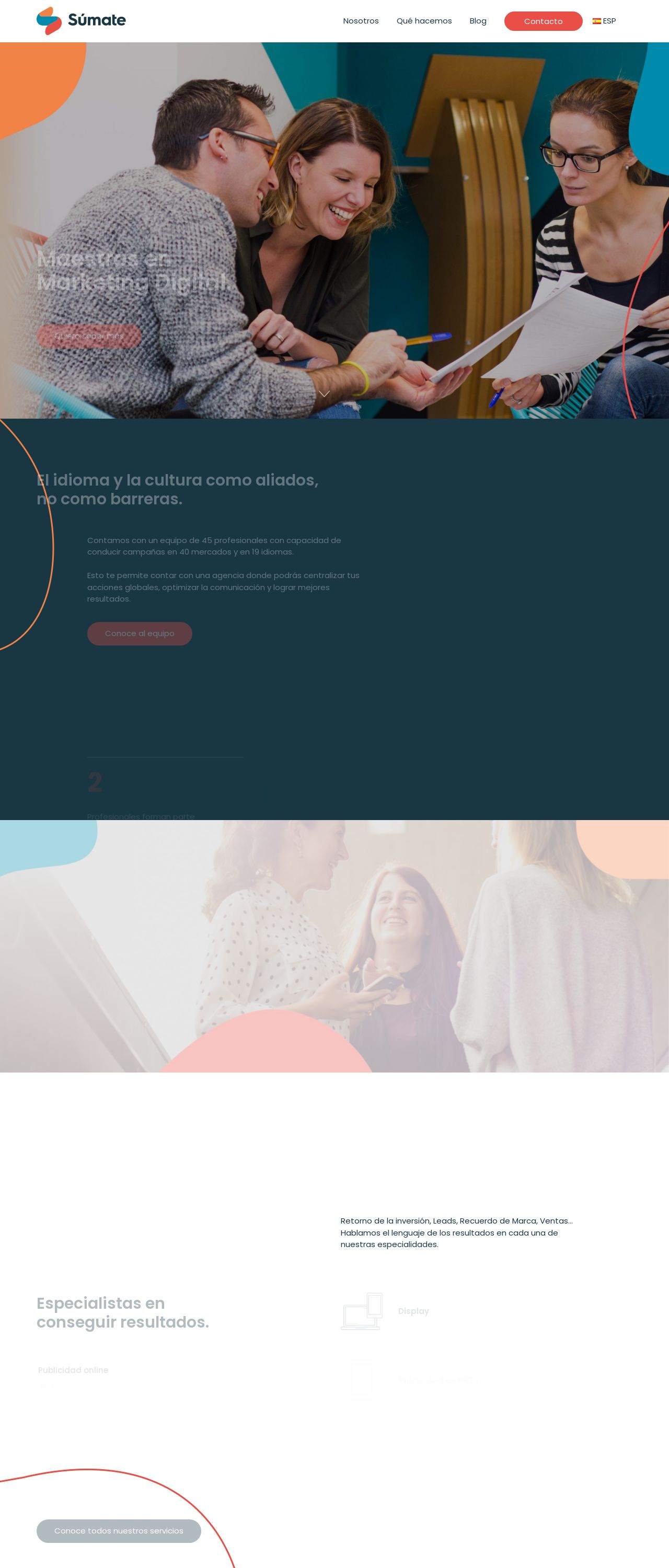
Rate your website in seconds – get instant feedback.
I will rate your website's design and give recommendations to enhance its visual appeal and user experience. See how your site ranks on the leaderboard!
SÚMATE | Agencia de Marketing Online

Analyzed by AI for fun and insights - not to be taken too seriously!
Visual Design
Wow, what a visually stunning website! The color scheme is absolutely on point, with a bold and modern palette that immediately grabs your attention. The dark blue tone provides a sleek and professional backdrop, while the pops of orange and red add a touch of playfulness and energy. It's clear that the designers have put thought into creating a cohesive and engaging visual identity. The typography is clean and easy to read, with a clear hierarchy of headings and paragraphs that makes it easy to scan the page. The use of white space is also well-executed, creating a sense of breathability and making the content feel uncluttered. One thing that really stands out is the use of imagery. The photographs are high-quality and relevant to the content, adding a touch of warmth and humanity to the page. The graphics and icons are also well-designed, adding a touch of personality and whimsy to the design. Overall, the visual design of this website is top-notch. It's modern, engaging, and effectively communicates the brand's message.
Recommendation:
Consider adding more interactive elements to enhance user engagement.
Layout and Clarity
The layout of this website is clear and easy to follow, with a logical flow of information that makes it easy to navigate. The use of sections and headings helps to break up the content and create a sense of hierarchy, making it easy to scan the page and find what you're looking for. The content is well-organized and easy to read, with short paragraphs and bullet points that make it easy to digest. The use of white space is also effective in creating a sense of breathability and making the content feel uncluttered. One thing that could be improved is the use of calls-to-action (CTAs). While there are some CTAs on the page, they could be more prominent and attention-grabbing. Additionally, some of the sections could be condensed or combined to make the page feel less cluttered. Overall, the layout and clarity of this website are strong, but there's room for improvement.
Recommendation:
Consider condensing sections and using more prominent CTAs.
Content
The content of this website is informative and engaging, with a clear and concise tone that...that makes it easy to understand the services and benefits of the agency. The use of headers and subheadings helps to break up the content and create a clear hierarchy of information, making it easy to scan the page and find what you're looking for. The language is also clear and concise, avoiding jargon and technical terms that might confuse non-experts. One thing that stands out is the use of social proof, with customer testimonials and case studies that demonstrate the agency's expertise and success. This helps to build trust and credibility with potential clients, and provides a sense of reassurance that the agency can deliver results. However, there are a few areas where the content could be improved. Some of the paragraphs are a bit long and dense, which can make them feel overwhelming to read. Additionally, there could be more visuals and graphics to break up the text and make the page feel more engaging. Overall, the content of this website is strong, but could benefit from a few tweaks to make it feel more engaging and easy to read.
Recommendation:
Consider breaking up long paragraphs and adding more visuals.
This website was last rated on Dec. 15, 2024, 12:36 p.m.
Disclaimer: ratemysite.app is not affiliated with the website you are viewing, and does not endorse it in any way.
Ratings are subjective and based on AI's analysis. We filter out explicit or dangerous content, but cannot guarantee that all sites are safe.
All rights reserved. © ratemysite.app 2024. Contact: hello @ domain.
