Rate your website in seconds – get instant feedback.
I will rate your website's design and give recommendations to enhance its visual appeal and user experience. See how your site ranks on the leaderboard!

Best Site to Book Flight Tickets, Hotels, Cars, E-visa
Analyzed by AI for fun and insights - not to be taken too seriously!
Visual Design
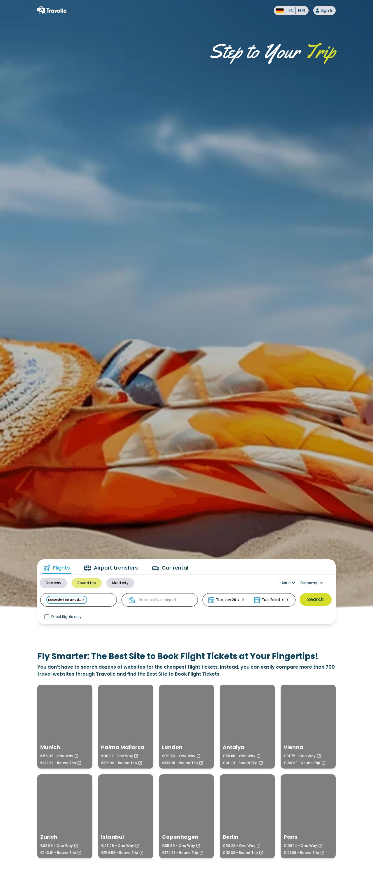
The visual design of the website is a combination of a beach scene with a blue sky, white clouds, and a sandy beach, featuring a collection of orange, white, and blue beach umbrellas. The color scheme is predominantly orange, white, and blue, with a touch of yellow. The overall design is clean and modern, with a clear and simple layout. The use of a beach scene as the background image is an excellent choice, as it evokes feelings of relaxation and vacation. The orange, white, and blue colors are bright and cheerful, making the website feel energetic and inviting. The beach umbrellas add a playful touch to the design, suggesting fun and adventure. However, the design could benefit from a few tweaks. The text is a bit too small, making it difficult to read. Additionally, the layout could be improved by adding more white space between the different elements, making it easier to navigate and focus on the content. Overall, the visual design is visually appealing and effectively conveys the website's theme of travel and adventure.
Recommendation:
Improve the font size and add more white space between elements to enhance readability and navigation.
Layout and Clarity
The layout of the website is clean and modern, with a clear and simple design. The use of a white background and orange, white, and blue colors creates a visually appealing contrast that draws the user's attention to the content. The layout is well-organized, with clear headings and concise paragraphs that make it easy to scan and read. However, the layout could benefit from a few improvements. The use of too many different font sizes and styles can be overwhelming, making it difficult to focus on the content. Additionally, the navigation menu could be improved by adding more prominent links to the different sections of the website. Overall, the layout is well-designed and effectively communicates the website's content.
Recommendation:
Simplify the font sizes and styles, and improve the navigation menu by adding more prominent links to the different sections.
Content
The content of the website is clear and concise, with easy-to-read paragraphs and headings. The use of short sentences and bullet points makes it easy to scan and understand the content. The website effectively communicates its purpose and offers a range of travel options, including flights, hotels, cars, and e-visas. However, the content could benefit from a few improvements. The use of too many technical terms and jargon can be overwhelming, making it difficult for non-travelers to understand. Additionally, the content could be improved by adding more visuals, such as images and videos, to break up the text and make the content more engaging. Overall, the content is well-written and effectively communicates the website's purpose and offerings.
Recommendation:
Use simpler language and add more visuals, such as images and videos, to make the content more engaging and accessible.
This website was last rated on Jan. 21, 2025, 12:36 p.m.
Disclaimer: ratemysite.app is not affiliated with the website you are viewing, and does not endorse it in any way.
Ratings are subjective and based on AI's analysis. We filter out explicit or dangerous content, but cannot guarantee that all sites are safe.

All rights reserved. © ratemysite.app 2024. Contact: hello @ domain.