Rate your website in seconds – get instant feedback.
I will rate your website's design and give recommendations to enhance its visual appeal and user experience. See how your site ranks on the leaderboard!
Inicio - Válvulas Vamex

Analyzed by AI for fun and insights - not to be taken too seriously!
Visual Design
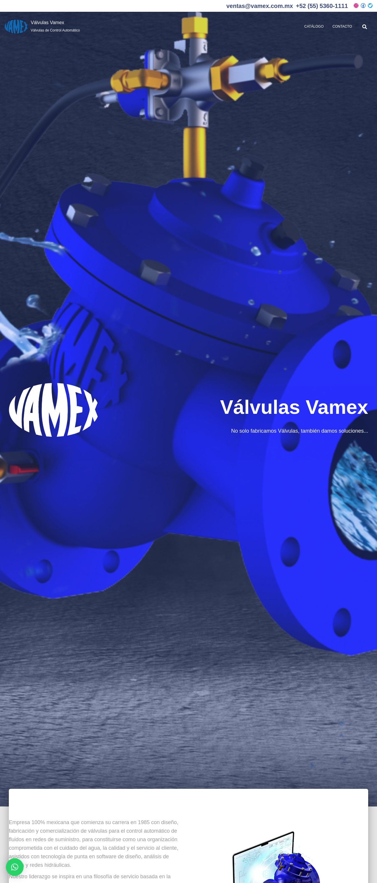
Hey there, Válvulas Vamex! Let's dive into the visual design of your website. The first thing that caught my eye was the stunning blue color scheme. It's bold, it's vibrant, and it's absolutely gorgeous. I love how it immediately grabs your attention and sets the tone for the rest of the website. The use of white text on top of the blue background is also a great choice, as it provides excellent contrast and makes the text easy to read. However, I did notice that the font size could be a bit larger in some areas, especially for those with visual impairments. But overall, the typography is clean and modern, which fits perfectly with the industrial theme of the website. One thing that did strike me as a bit odd was the placement of the social media icons at the top of the page. While it's great that you want to encourage visitors to connect with you on social media, the icons seem a bit out of place among the navigation menu. Perhaps consider moving them to the footer or a dedicated social media section to keep the top navigation clean and focused on the main menu items. Lastly, I couldn't help but notice the beautiful 3D images of the valves throughout the website. They're incredibly detailed and add a touch of sophistication to the overall design. However, I did feel that some of the images could be optimized for web use to reduce the page load time. A faster page load time would greatly improve the user experience and make your website feel more responsive. Overall, the visual design of your website is top-notch, and with a few minor tweaks, it can be truly exceptional.
Recommendation:
Optimize 3D images for web use and adjust font sizes for better readability.
Layout and Clarity
Now, let's talk about the layout and clarity of your website. Overall, the layout is well-organized and easy to follow. The use of clear headings and concise paragraphs makes it simple for visitors to quickly scan the page and find the information they're looking for. I also appreciate the use of bullet points and short sentences to break up the content and make it more scannable. One area for improvement is the "Válvulas Vamex" section. While the content is interesting, the layout feels a bit cluttered and overwhelming. Consider breaking up the text into smaller sections or using subheadings to create a clearer hierarchy of information. This will make it easier for visitors to quickly understand the main points and take away the key messages. I also noticed that the "MISIÓN" and "VISIÓN" sections feel a bit buried at the bottom of the page. While they're important statements, they might get lost among the other content. Consider moving them to a more prominent location, such as the top of the page or a dedicated section, to give them the attention they deserve. Lastly, I did feel that some of the images could be better optimized for web use. While they look great, they do slow down the page load time. Consider compressing them or using a plugin to lazy load them to improve the overall performance of the website. Overall, the layout and clarity of your website are excellent, and with a few minor adjustments, it can be truly exceptional.
Recommendation:
Break up cluttered sections and optimize images for web use.
Content
Now, let's dive into the content of your website. Overall, the content is engaging, informative, and well-written. I love how you've woven in personal touches, such as the story of your company's founding and growth. It makes the content feel more human and relatable. One thing that did strike me as a bit odd was the use of the phrase "No solo fabricamos Válvulas, también damos soluciones..." It feels a bit repetitive and could be condensed into a single sentence. Perhaps consider rephrasing it to something like "At Válvulas Vamex, we don't just manufacture valves – we provide solutions that..." This would make the content feel more concise and easier to read. I also noticed that some of the paragraphs could be broken up into shorter sentences. While the content is well-written, some of the sentences feel a bit long and could be split up to improve the flow and readability. Lastly, I did feel that some of the content could be better optimized for search engines. While you've done a great job of including relevant keywords, some of the headings and subheadings could be more descriptive and attention-grabbing. Consider using more descriptive language and including keywords in the headings to improve the overall SEO of the website. Overall, the content of your website is excellent, and with a few minor tweaks, it can be truly exceptional.
Recommendation:
Condense repetitive phrases and optimize content for SEO.
This website was last rated on Nov. 21, 2024, 2:51 p.m.
Disclaimer: ratemysite.app is not affiliated with the website you are viewing, and does not endorse it in any way.
Ratings are subjective and based on AI's analysis. We filter out explicit or dangerous content, but cannot guarantee that all sites are safe.
All rights reserved. © ratemysite.app 2024. Contact: hello @ domain.
