Rate your website in seconds – get instant feedback.
I will rate your website's design and give recommendations to enhance its visual appeal and user experience. See how your site ranks on the leaderboard!

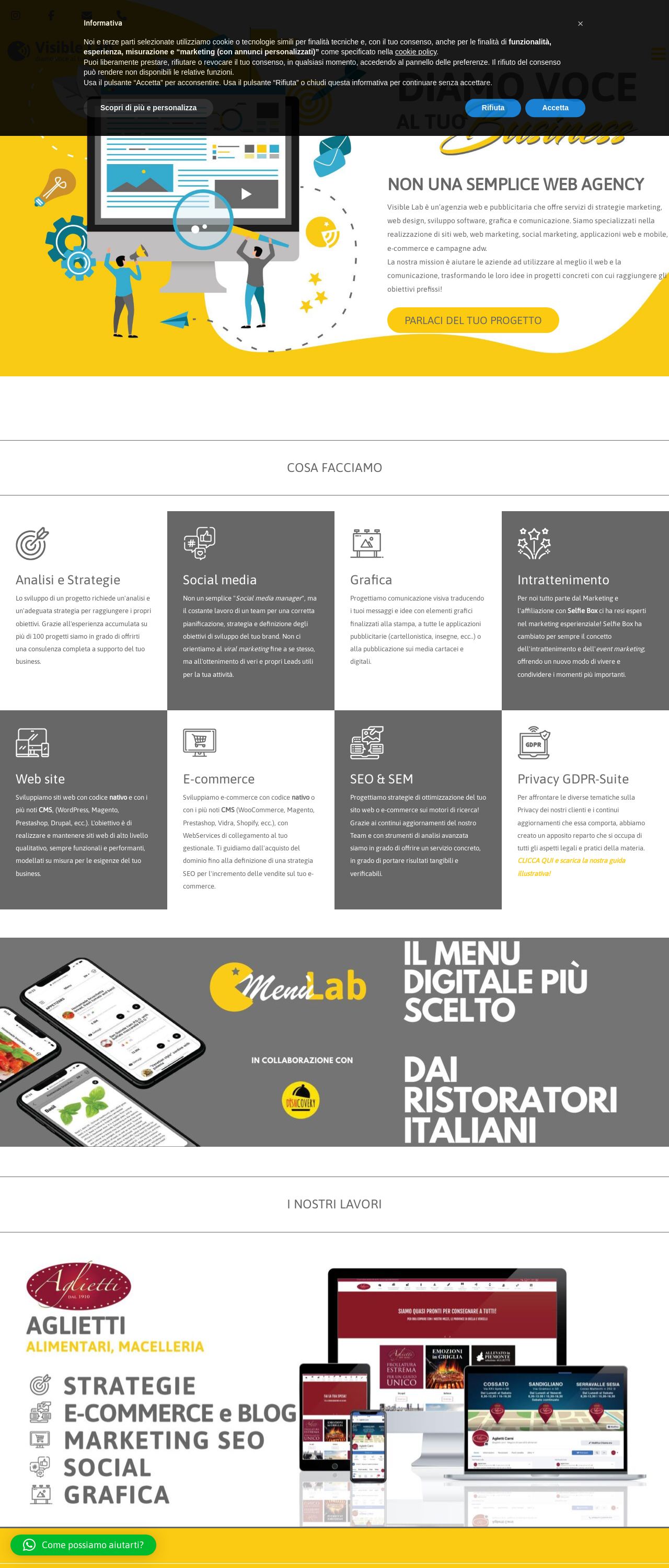
Web agency strategie marketing, web design e grafica - Visible Lab srl
Analyzed by AI for fun and insights - not to be taken too seriously!
Visual Design
The website's visual design is a key aspect of its overall appeal. At first glance, the website appears to be well-designed, with a clean and modern aesthetic. However, upon closer inspection, there are some areas that could be improved. One of the most striking features of the website is its use of color. The dominant color scheme is a bright and cheerful yellow, which is used consistently throughout the website. While this color is certainly eye-catching, it may not be to everyone's taste. Some users may find it overwhelming or even garish. In addition to the color scheme, the website's typography is also noteworthy. The font used is clear and easy to read, which is important for a website that aims to communicate complex information to its users. However, the font size could be larger in some areas, particularly in the body text. Another aspect of the website's design that could be improved is its imagery. While the website features some high-quality images, they are not used consistently throughout the site. In some areas, the images are small and poorly optimized, which can make them difficult to view. Overall, the website's visual design is good but could be improved in some areas. The use of a consistent color scheme and clear typography are major strengths, but the website could benefit from larger font sizes and more consistent use of high-quality images.
Recommendation:
Consider using a more muted color scheme and increasing the font size in some areas.
Layout and Clarity
The website's layout and clarity are also important aspects of its design. The website's layout is generally well-organized, with clear headings and concise paragraphs. However, there are some areas where the layout could be improved. One area where the layout could be improved is in the navigation menu. The menu is located at the top of the page, but it is not immediately clear what each menu item links to. This could make it difficult for users to find the information they need. Another area where the layout could be improved is in the body text. While the font is clear and easy to read, the paragraphs are sometimes long and blocky. This can make it difficult for users to scan the text quickly. In terms of clarity, the website does a good job of communicating complex information in a clear and concise manner. The language is straightforward and easy to understand, and the website uses headings and subheadings effectively to break up the text. Overall, the website's layout and clarity are good, but there are some areas where they could be improved. A more intuitive navigation menu and shorter paragraphs would make the website easier to use.
Recommendation:
Consider reorganizing the navigation menu to make it clearer what each menu item links to, and consider breaking up long paragraphs into shorter ones.
Content
The website's content is also an important aspect of its design. The website does a good job of communicating complex information in a clear and concise manner. The language is straightforward and easy to understand, and the website uses headings and subheadings effectively to break up the text. However, there are some areas where the content could be improved. One area is in the use of images. While the website features some high-quality images, they are not used consistently throughout the site. In some areas, the images are small and poorly optimized, which can make them difficult to view. Another area where the content could be improved is in the use of multimedia elements. The website does not use any multimedia elements, such as videos or podcasts, which could help to break up the text and make the website more engaging. Overall, the website's content is good, but there are some areas where it could be improved. The website could benefit from more consistent use of high-quality images and the addition of multimedia elements.
Recommendation:
Consider adding more images and multimedia elements to break up the text and make the website more engaging.
This website was last rated on Feb. 5, 2025, 8:09 p.m.
Disclaimer: ratemysite.app is not affiliated with the website you are viewing, and does not endorse it in any way.
Ratings are subjective and based on AI's analysis. We filter out explicit or dangerous content, but cannot guarantee that all sites are safe.

All rights reserved. © ratemysite.app 2024. Contact: hello @ domain.