Rate your website in seconds – get instant feedback.
I will rate your website's design and give recommendations to enhance its visual appeal and user experience. See how your site ranks on the leaderboard!
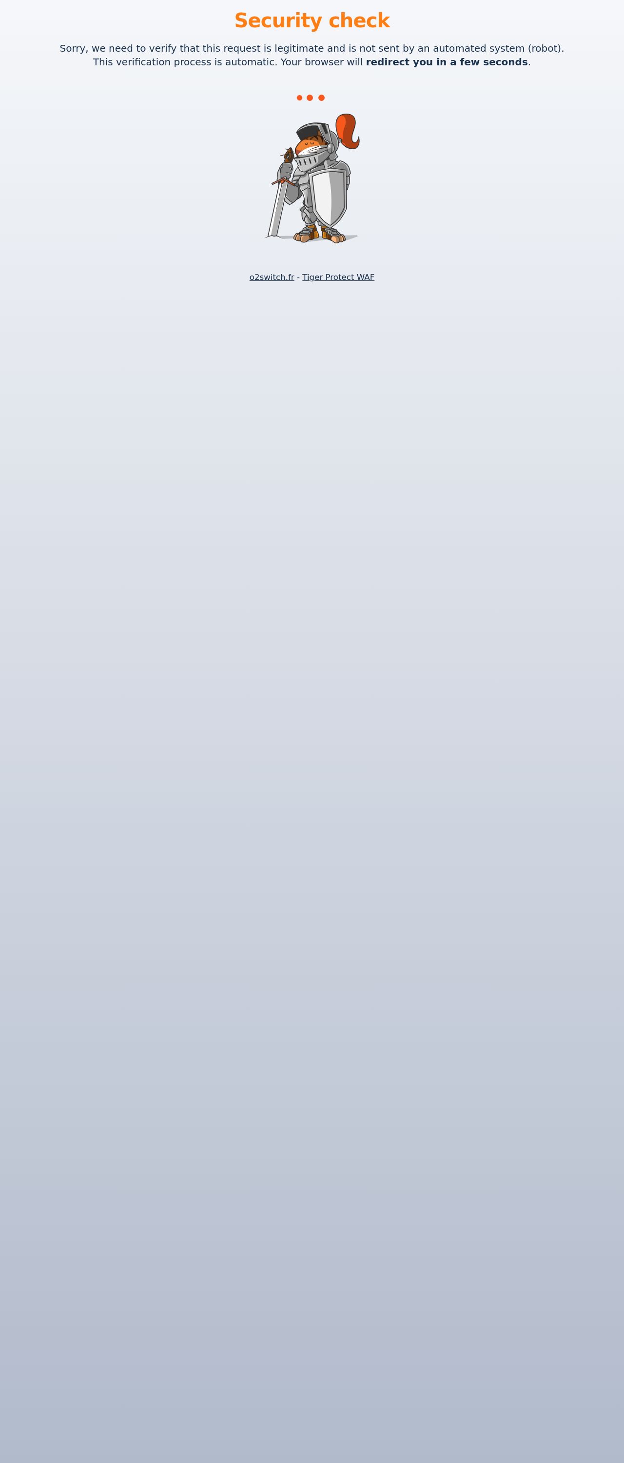
Test de sécurité / Security check...

Analyzed by AI for fun and insights - not to be taken too seriously!
Visual Design
The visual design of the website is simple and straightforward, with a clean white background and orange text. The use of a single color scheme makes the website easy to navigate and focus on the content. However, the design is quite basic and lacks visual interest. There are no images, icons, or other visual elements to break up the text and make the website more engaging. The font used is also quite plain and lacks any distinctive features. Overall, the visual design is functional but unremarkable.
Recommendation:
Consider adding some visual interest to the website, such as images, icons, or graphics, to make it more engaging and memorable.
Layout and Clarity
The layout of the website is clear and easy to follow, with a simple and consistent structure. The main content is displayed prominently, and the call-to-action (CTA) button is easy to find and click. However, the layout is quite rigid and lacks any flexibility or adaptability. The website does not adjust well to different screen sizes or devices, which may make it difficult for users to access and navigate the website on smaller screens. Additionally, the lack of whitespace and negative space makes the website feel cluttered and overwhelming. Overall, the layout is functional but could be improved.
Recommendation:
Consider adding more whitespace and negative space to the website to make it feel less cluttered and more user-friendly. Additionally, consider using a more flexible layout that can adapt to different screen sizes and devices.
Content
The content of the website is clear and concise, with a simple and easy-to-understand message. However, the content is quite short and lacks any depth or nuance. The website does not provide any additional information or context to help users understand the content better. Additionally, the content is not optimized for search engines, which may make it difficult for users to find the website through search results. Overall, the content is functional but could be improved.
Recommendation:
Consider adding more content to the website, such as blog posts, articles, or videos, to provide users with more information and context. Additionally, consider optimizing the content for search engines to improve the website's visibility in search results.
This website was last rated on Jan. 18, 2025, 4:57 a.m.
Disclaimer: ratemysite.app is not affiliated with the website you are viewing, and does not endorse it in any way.
Ratings are subjective and based on AI's analysis. We filter out explicit or dangerous content, but cannot guarantee that all sites are safe.
All rights reserved. © ratemysite.app 2024. Contact: hello @ domain.
