Rate your website in seconds – get instant feedback.
I will rate your website's design and give recommendations to enhance its visual appeal and user experience. See how your site ranks on the leaderboard!

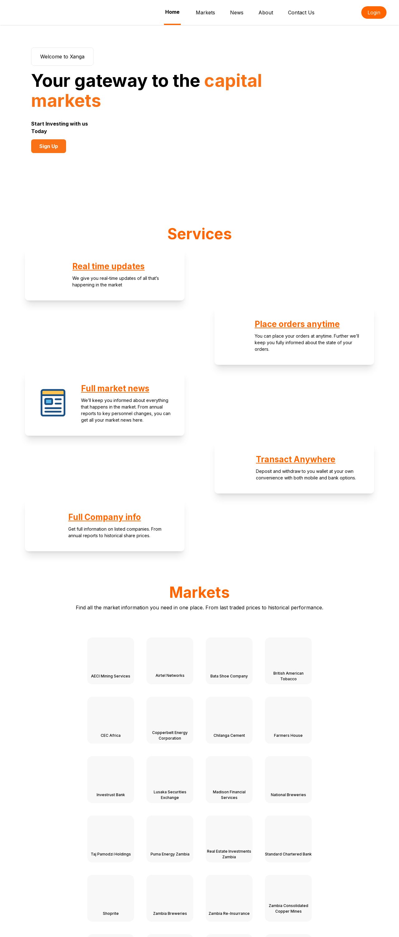
Xanga
Analyzed by AI for fun and insights - not to be taken too seriously!
Visual Design
The visual design of the Xanga website is clean and modern, with a predominantly white background that provides a clear and uncluttered space for the content. The use of orange accents throughout the website adds a touch of warmth and energy, making it more engaging and inviting. However, the design could benefit from a bit more creativity and originality to make it stand out from other financial websites. The font used throughout the website is clear and easy to read, but it's a bit too generic and lacks personality. Consider adding a custom font or a unique typographic treatment to give the website a more distinctive look. The images and graphics used on the website are simple and straightforward, but they could be more visually appealing. Consider using more dynamic and creative graphics to break up the text and add visual interest. Overall, the visual design of the Xanga website is clean and modern, but it could benefit from a bit more creativity and originality to make it stand out from other financial websites.
Recommendation:
Consider adding a custom font or a unique typographic treatment to give the website a more distinctive look. Also, consider using more dynamic and creative graphics to break up the text and add visual interest.
Layout and Clarity
The layout of the Xanga website is well-organized and easy to navigate, with clear headings and concise paragraphs that make it simple to scan and understand the content. The use of white space effectively separates the different sections and makes the content feel more manageable. However, the layout could benefit from a bit more balance and harmony. Some sections, such as the services page, feel a bit cluttered and overwhelming, with too much text and not enough white space. Consider breaking up the content into smaller sections or using more visual elements to create a sense of balance and harmony. The clarity of the content is generally good, with clear and concise language that is easy to understand. However, some sections, such as the markets page, could benefit from a bit more explanation and context to help readers understand the information better. Overall, the layout of the Xanga website is well-organized and easy to navigate, but could benefit from a bit more balance and harmony.
Recommendation:
Consider breaking up the content into smaller sections or using more visual elements to create a sense of balance and harmony. Also, consider adding a bit more explanation and context to help readers understand the information better.
Content
The content of the Xanga website is informative and well-researched, with a good balance of technical and non-technical information. The language is clear and concise, making it easy for readers to understand the information. However, the content could benefit from a bit more creativity and originality. Some sections, such as the about us page, feel a bit too generic and lack personality. Consider adding more personal touches and anecdotes to make the content feel more relatable and engaging. The content is well-structured and easy to follow, with clear headings and concise paragraphs that make it simple to scan and understand the information. However, some sections, such as the news page, could benefit from a bit more organization and categorization to make it easier for readers to find the information they need. Overall, the content of the Xanga website is informative and well-researched, but could benefit from a bit more creativity and originality.
Recommendation:
Consider adding more personal touches and anecdotes to make the content feel more relatable and engaging. Also, consider organizing and categorizing the content better to make it easier for readers to find the information they need.
This website was last rated on Feb. 13, 2025, 12:49 p.m.
Disclaimer: ratemysite.app is not affiliated with the website you are viewing, and does not endorse it in any way.
Ratings are subjective and based on AI's analysis. We filter out explicit or dangerous content, but cannot guarantee that all sites are safe.

All rights reserved. © ratemysite.app 2024. Contact: hello @ domain.