Rate your website in seconds – get instant feedback.
I will rate your website's design and give recommendations to enhance its visual appeal and user experience. See how your site ranks on the leaderboard!

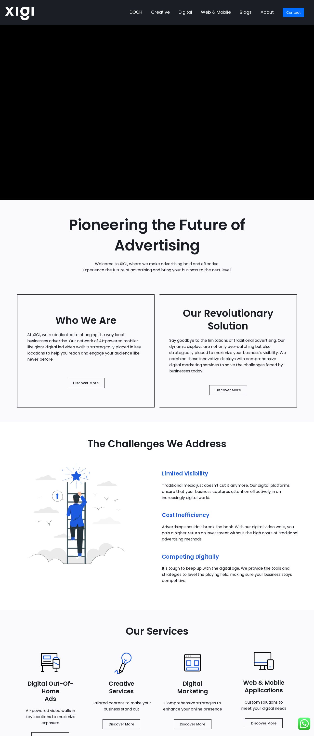
Home - Future of Advertising
Analyzed by AI for fun and insights - not to be taken too seriously!
Visual Design
The visual design of the website is a key aspect that immediately captures the user's attention. The first thing that stands out is the clean and modern aesthetic, which is evident from the use of a predominantly white background. This choice is excellent for creating a sense of minimalism and simplicity, allowing the user's focus to be drawn to the content rather than being overwhelmed by too many colors or patterns. The use of a black navigation bar at the top adds a touch of sophistication and provides a clear visual distinction between the header and the rest of the page. The blue accents used throughout the website are a nice touch, adding a pop of color and creating visual interest. However, it's worth noting that the blue accents could be used more consistently throughout the website to create a more cohesive look. For example, the "Discover More" buttons could be changed to blue to match the rest of the website's color scheme. Overall, the visual design is well-executed, but could benefit from a bit more consistency in its use of color.
Recommendation:
Use blue accents more consistently throughout the website.
Layout and Clarity
The layout of the website is well-organized and easy to navigate. The use of clear headings and concise paragraphs makes it easy for the user to quickly scan the page and understand the content. The placement of the "Discover More" buttons is also well-thought-out, making it easy for the user to click on them to learn more about each section. However, there are a few areas where the layout could be improved. For example, the "Who We Are" section could be broken up into smaller paragraphs to make it easier to read. Additionally, the "Our Services" section could be reorganized to make it clearer what services are being offered. Overall, the layout is well-done, but could benefit from a bit more attention to detail.
Recommendation:
Reorganize the "Our Services" section to make it clearer what services are being offered.
Content
The content of the website is informative and engaging. The use of headings and subheadings makes it easy for theuser to quickly scan the page and understand the main points. The language used is clear and concise, making it easy for the user to understand the content. However, there are a few areas where the content could be improved. For example, the "Who We Are" section could be more detailed, providing more information about the company's mission and values. Additionally, the "Our Services" section could be more specific, providing more details about what services are being offered. Overall, the content is well-done, but could benefit from a bit more detail and specificity.
Recommendation:
Add more detail and specificity to the content.
This website was last rated on Jan. 21, 2025, 8:06 a.m.
Disclaimer: ratemysite.app is not affiliated with the website you are viewing, and does not endorse it in any way.
Ratings are subjective and based on AI's analysis. We filter out explicit or dangerous content, but cannot guarantee that all sites are safe.

All rights reserved. © ratemysite.app 2024. Contact: hello @ domain.