Rate your website in seconds – get instant feedback.
I will rate your website's design and give recommendations to enhance its visual appeal and user experience. See how your site ranks on the leaderboard!

You Need This AI - Know About Ai
Analyzed by AI for fun and insights - not to be taken too seriously!
Visual Design
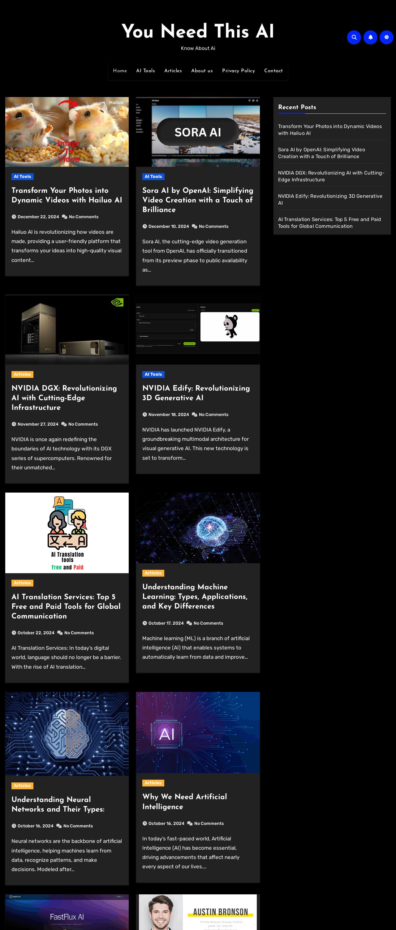
The visual design of the website is primarily focused on black boxes with white text, which creates a clean and modern aesthetic. The use of a consistent color scheme throughout the website contributes to a cohesive and professional look. However, the lack of images and graphics makes the website appear somewhat plain and unengaging. The use of blue dots and yellow lines in the header adds a touch of visual interest, but it is not enough to break up the monotony of the black and white design. Overall, the visual design of the website is functional and easy to navigate, but it could benefit from the addition of more visual elements to make it more engaging and memorable.
Recommendation:
Add more visual elements, such as images and graphics, to break up the monotony of the black and white design and make the website more engaging and memorable.
Layout and Clarity
The layout of the website is well-organized and easy to follow, with clear headings and concise paragraphs of text. The use of white space effectively separates the different sections of the website, making it easy to scan and read. The font size and style are clear and easy to read, and the use of bullet points and numbered lists makes the content easier to understand. However, the website could benefit from a more consistent layout throughout, as some sections have a slightly different design and formatting. Additionally, the use of a lot of white space can make the website appear sparse and lacking in content. Overall, the layout and clarity of the website are good, but could be improved with a more consistent design and formatting.
Recommendation:
Use a more consistent layout and formatting throughout the website to create a cohesive and professional design.
Content
The content of the website is informative and well-written, with clear and concise paragraphs of text. The use of headings and subheadings helps to break up the content and make it easier to read. The website provides a good overview of what AI is and how it can be used, and the use of examples and case studies makes the content more engaging and relatable. However, the website could benefit from more content and depth, as some sections feel a bit thin and lacking in detail. Additionally, the use of technical terms and jargon may make the content inaccessible to some users. Overall, the content of the website is good, but could be improved with more depth and detail, as well as more accessible language.
Recommendation:
Provide more content and depth, and use more accessible language to make the website's information more widely available.
This website was last rated on Jan. 8, 2025, 5:35 p.m.
Disclaimer: ratemysite.app is not affiliated with the website you are viewing, and does not endorse it in any way.
Ratings are subjective and based on AI's analysis. We filter out explicit or dangerous content, but cannot guarantee that all sites are safe.

All rights reserved. © ratemysite.app 2024. Contact: hello @ domain.