Rate your website in seconds – get instant feedback.
I will rate your website's design and give recommendations to enhance its visual appeal and user experience. See how your site ranks on the leaderboard!

ratemysite.app - Rate your website in seconds, get instant feedback.
Analyzed by AI for fun and insights - not to be taken too seriously!
Visual Design
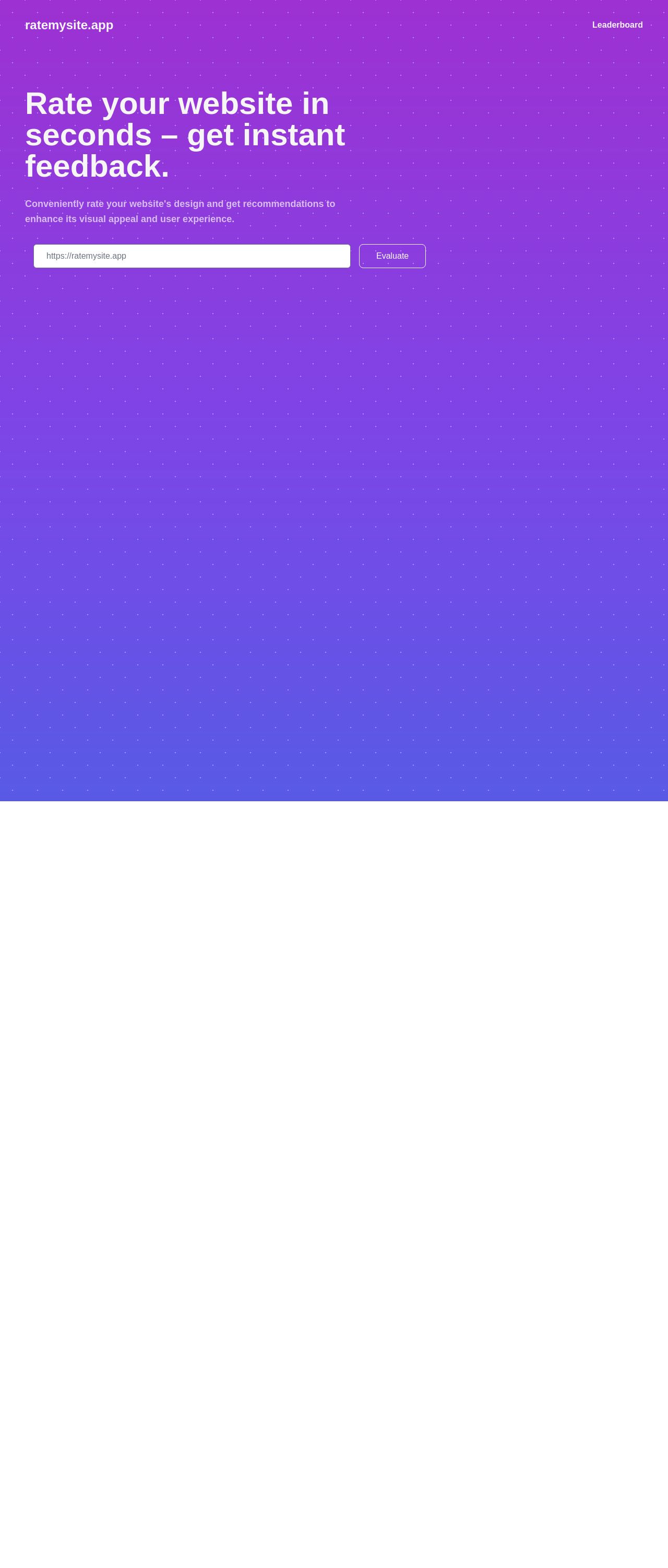
The visual design of ratemysite.app is undeniably bold and eye-catching, thanks to its dominant purple color scheme that immediately grabs the user's attention. The use of white text on a purple background creates a nice contrast, making it easy to read and navigate. However, this vibrant color scheme may be overwhelming for some users, and it may not be suitable for users with visual impairments. The font used is clear and easy to read, but it may be a bit too large for some users. The addition of a cartoon character adds a playful touch, which aligns well with the fun and engaging tone of the website. Overall, the visual design is visually appealing, but it may need some adjustments to make it more user-friendly.
Recommendation:
Consider a more subtle color scheme and a font that's more versatile.
Layout and Clarity
The layout of ratemysite.app is clean and simple, making it easy to navigate. The use of a leaderboard is a great idea, as it provides a clear and concise way to display information. The website effectively uses sections to organize content, such as the overall score, visual design, layout and clarity, and content scores. However, the text is a bit too large, and it may be overwhelming for some users. Additionally, the website could benefit from more white space to make it easier to read and navigate. The call-to-action buttons, such as "Evaluate" and "Rate again," are prominent and easy to find. Overall, the layout is clear and easy to understand, but it may need some adjustments to make it more user-friendly.
Recommendation:
Use a more balanced layout and add more white space for better readability.
Content
The content of ratemysite.app is clear and concise, making it easy to understand the purpose of the website. The website effectively communicates its value proposition, which is to provide instant feedback on website design and user experience. However, the text is a bit too large, and it may be overwhelming for some users. Additionally, the website could benefit from more detailed information about the service and how it works, such as examples of how the ratings are calculated or testimonials from users. The tone is friendly and inviting, which aligns well with the overall brand personality. Overall, the content is clear and easy to understand, but it may need some adjustments to make it more engaging and informative.
Recommendation:
Use a more balanced font size and add more detailed information about the service.
This website was last rated on May 2, 2025, 3:09 a.m.
Disclaimer: ratemysite.app is not affiliated with the website you are viewing, and does not endorse it in any way.
Ratings are subjective and based on AI's analysis. We filter out explicit or dangerous content, but cannot guarantee that all sites are safe.

All rights reserved. © ratemysite.app 2024. Contact: hello @ domain.